
Vehicles per thousand people in 2006 in China was similar to the United States in 1915, but ten years later, the number has grown.
Transportation Technologies Office
October 8, 2018Vehicles per thousand people in 2006 in China was similar to the United States in 1915, but ten years later, the number has grown to approximately the same as where the United States was in 1923. The figures below show the number of motor vehicles per thousand people for various countries/regions. The data for the United States are displayed by the black line which goes from 1900 to 2016. The color points labeled on that line show data for the other countries/regions around the world and how their vehicles per thousand people compare to the United States at two different points in time, 2006 and 2016. For instance, the top figure shows that in 2006, Eastern Europe’s vehicles per thousand people was about where the United States was in 1942 (orange circle), but by 2016 it is about where the United States was in 1953 (orange diamond).
The lower part of the figure (1900-1930) is enlarged in the second figure below. The countries/regions on the lower figure with the greatest increases in the ten-year span were China, Brazil, and Central and South America.
Vehicles per Thousand People: U.S. (Over Time) Compared to Other Countries (in 2006 and 2016)
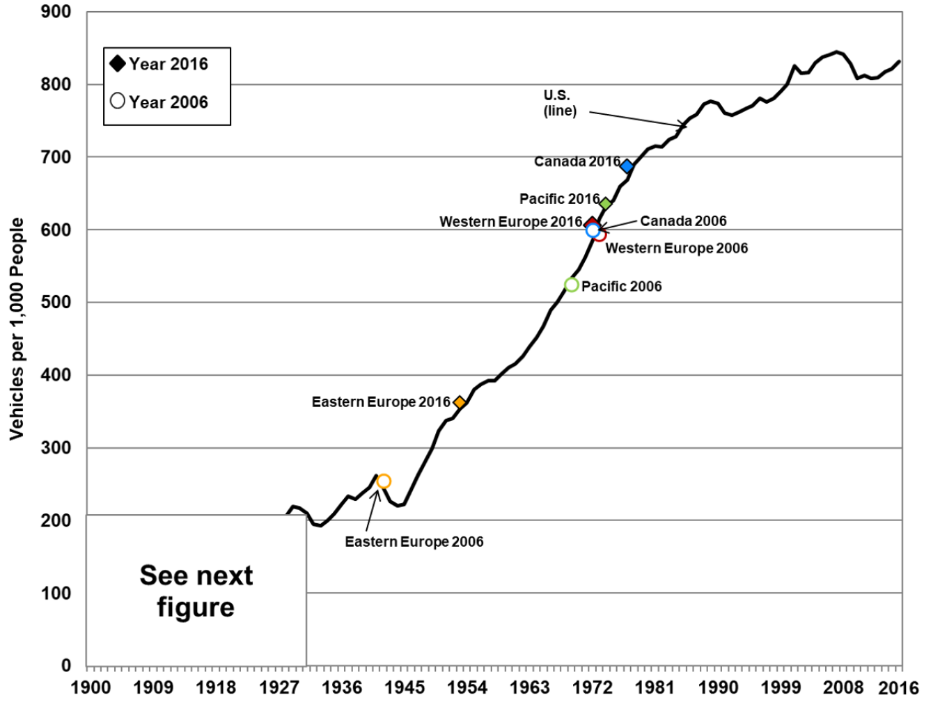
Figure Inset: Vehicles per Thousand People: U.S. (Over Time) Compared to Other Countries (in 2006 and 2016)
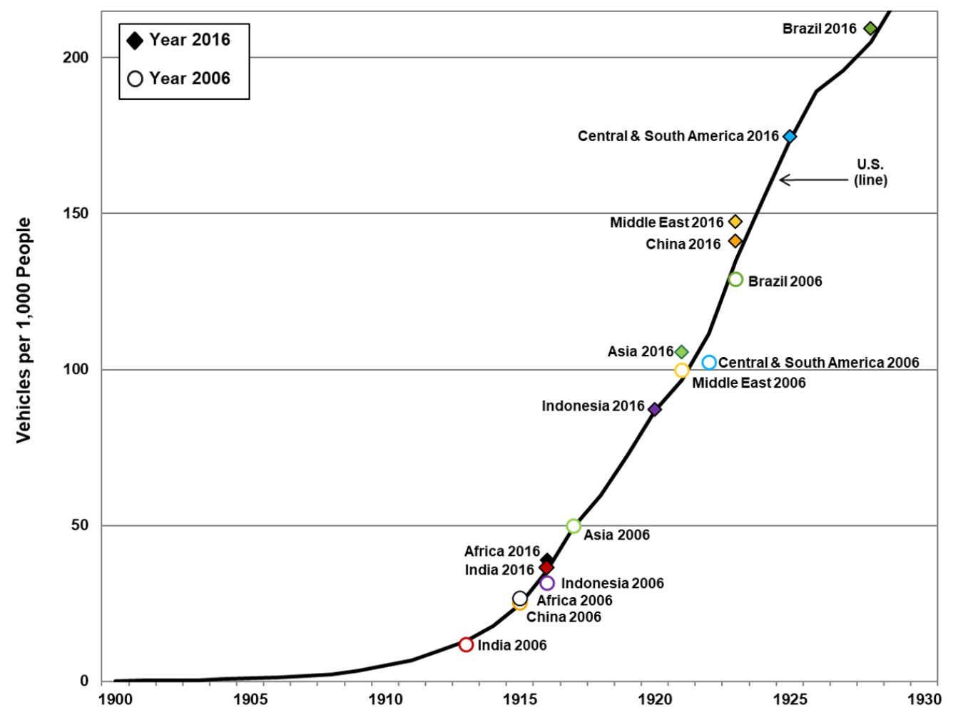
Note: Includes cars, light trucks, heavy trucks, and buses registered in each country.
Source: Oak Ridge National Laboratory, Transportation Energy Data Book: Edition 36.2, August 2018. (Original data from Ward’s Automotive and U.S. Bureau of the Census, International Data Base (IDB) midyear population estimates.)