As negotiations continue at COP21, get to know the attending countries’ carbon dioxide emissions, and how they compare to your home state.
December 7, 2015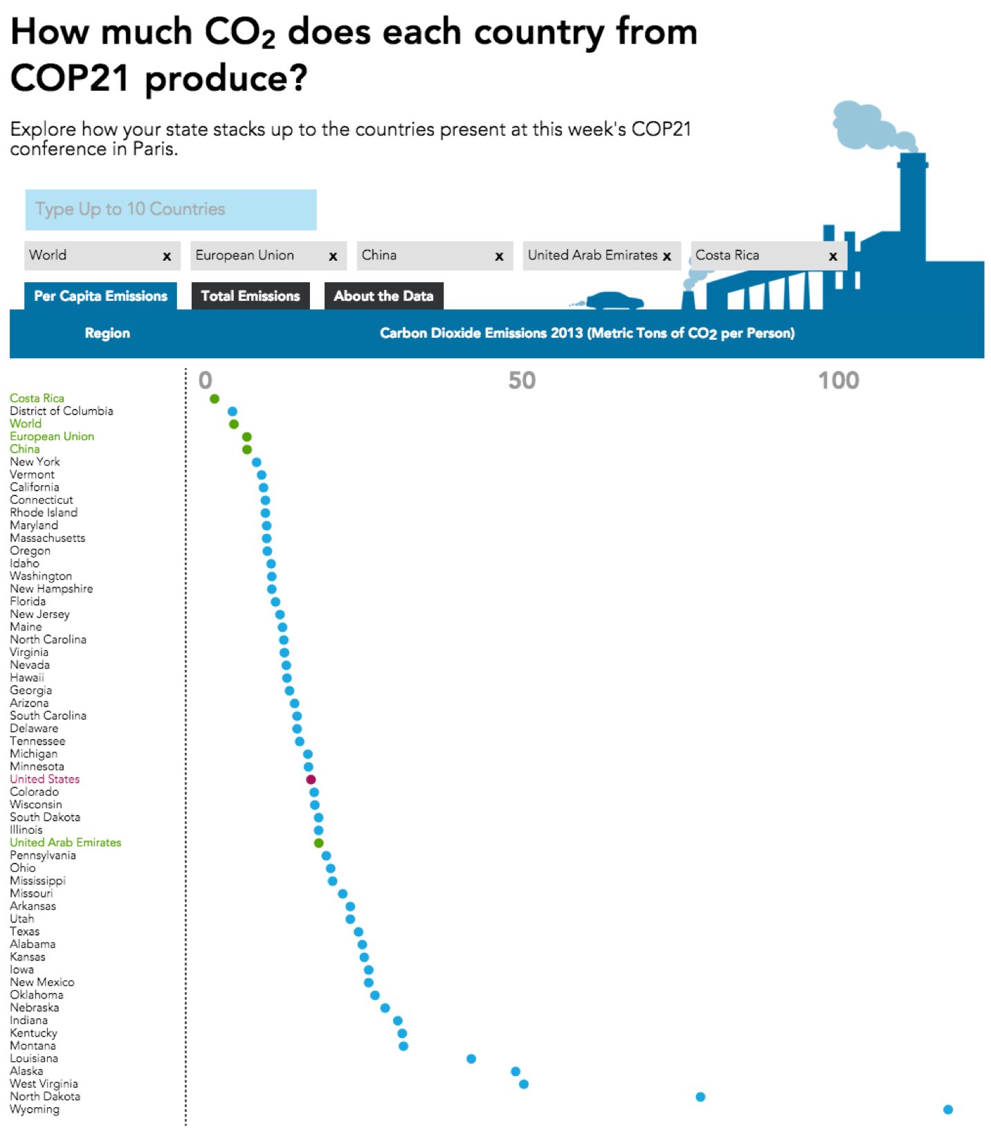
Right now, world leaders are meeting in Paris at COP21 to address one of the most urgent challenges of our time: climate change.
Carbon pollution is the main driver of global climate change. But how much does each country contribute? The United States is one of the world’s largest carbon emitters, with more than 318 million people -- and many states have population sizes greater than most nations.
To help put this into perspective, we developed the interactive above to let you compare annual carbon emissions of U.S. states with other countries. Enter up to 10 countries to visualize carbon emissions per person or in total.
The results may surprise you. Nations like China have enormous populations, and therefore very large amounts of total carbon emitted each year -- almost 9 billion metric tons of CO2 in 2013, or approximately 28 percent of the world’s carbon emissions. But when we look at how much carbon each person emits, on average, we see a very different story. No state in the U.S. has a lower per capita carbon emissions than large nations like China, India and Brazil.
It’s important to flip back and forth between per capita and total emissions in order to get the complete picture of carbon dioxide emissions around the globe. The big picture is more complicated than you might think -- all the more reason why it’s critical for all nations to work together to reduce our collective carbon emissions. It’s no less important for smaller nations with larger per capita emissions to heed the call to curb emissions, than for large nations with lower per capita emissions. We’re all in this together and every little bit counts.
As negotiations continue at COP21, get to know the attending countries’ carbon profiles, and how they compare to your home state.
KEY FACTS
New interactive lets you compare annual carbon emissions of U.S. states with other countries.
Enter up to 10 countries to visualize carbon emissions per person or in total.
Flip back and forth between per capita and total emissions for a full picture of carbon dioxide emissions around the globe.