
This page is a guide to using the H2 Matchmaker map. H2 Matchmaker is intended to help facilitate regional hydrogen team formation by allowing hydrogen producers, end users, and other stakeholders to self-identify and align potential needs in specific geographic areas within the United States.
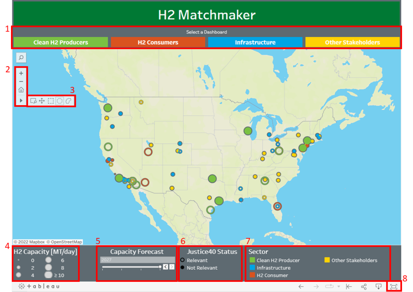
Box 1
Box 1 highlights the dashboard navigation panel at the top of the map. Use these buttons to navigate between the five dashboards: Main, Clean H2 Producers, H2 Consumers, Infrastructure, and Other Stakeholders.
Box 2
Box 2 highlights the map control panel near the upper left corner of the map. The + and – symbols allow you zoom into and out of the map, respectively, while the house symbol resets the map to the home view, which brings all the activities into view. The right facing triangle expands into the cursor selector menu when clicked, which is highlighted in box 3.
Box 3
Box 3 highlights the cursor selector menu. This menu is activated by clicking the right facing triangle in the map control panel (see box 2). The cursor selector menu changes how the mouse cursor interacts with the map. The first symbol (a box with a magnifying glass in the bottom right corner) allows you to zoom into a region of interest by clicking and dragging a box around it. The second symbol (four arrows pointing in the cardinal directions) allows you to pan (drag and reposition) the map using the mouse cursor. The remaining three symbols are multi-point selector tools that allow you to click and drag either a box, circle, or lasso shape around multiple activities to select them as a group. In the "Clean H2 Producers" and "H2 Consumers" dashboards, these tools will show the total hydrogen produced or consumed by the selected activities.
Box 4
Box 4 highlights the H2 capacity legend at the bottom of the map. The sizes of the pins for H2 Producers and H2 Consumers pins are scaled based on their hydrogen production and consumption, respectively. The H2 capacity legend shows the magnitude of this scaling. Note: the pins for Infrastructure and Other Stakeholders are not scaled by hydrogen capacity; they are given an equal scaling that allows them to be more easily viewed.
Box 5
Box 5 highlights the capacity forecast slider in the legend section at the bottom of the map. When available, this slider displays the self-identified hydrogen consumption and production forecast provided for each activity in 2022, 2023, 2025, and 2027.
Box 6
Box 6 highlights the Justice40 Status legend at the bottom of the map. DOE is committed to the Justice40 (J40) Initiative, which states that 40% of the overall benefits of certain federal investments will flow to disadvantaged communities and that projects will have minimal negative impacts on communities with environmental justice concerns. The Justice40 Interim Guidance provides a broad definition of disadvantaged communities (page 2). This status designation (open circles) represents communities and groups that would be relevant to the J40 Initiative's intent to increase benefits and reduce harm.
Box 7
Box 7 highlights the sector legend at the bottom of the map. This legend shows which pin colors correspond to specific sectors in each dashboard.
Box 8
Box 8 highlights the view maximization button in the bottom right corner of the map. Clicking this button allows the map to be viewed in full screen mode.